
Building your visual identity as an artist
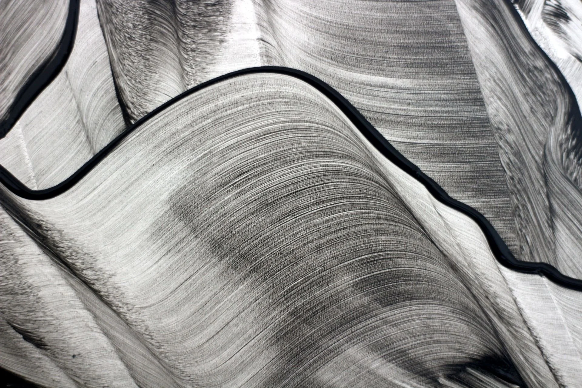
Photo by Landiva Weber on Pexels
Your art is always the core of your visual identity, but it's not the whole story. The supporting assets you choose, brand colours, font choices, photography style, all help craft a cohesive and polished visual story around it. In this post I'm sharing elements you may want to consider when building your visual brand as an artist.
First off, I keep saying visual elements, because there’s a lot of stuff that goes on behind the scenes that isn’t seen, which is equally important, but for this post, I'm just going to focus on the visual side of things.
Your Work
You’re an artist, your work is what people will be drawn into, this is what matters most, and is the number one asset in your visual identity. You take all your cues from your work, that is your guiding principle.
Wordmark logo
As an artist, keeping things simple is often the best choice. Your name matters and deserves to be shared, but it'll be seen alongside your work, and that's where the focus should stay.
A wordmark logo is just your name, it can be in any style, clean san serif, a playful display, timeless serif or a script thats full of character. It’s all about finding a style that works well for you and your work. Something that compliments it. It's worth trying a few styles before committing, not every font will feel right next to your name, even if it looks good on its own.
Finding the right look and feel can take a little time, but it's worth it to land on something you're really happy with.
Logo variations
Having a variety of different logo layouts is really helpful, just so you have them available to you. A stacked version (something that would fit in a square), is always good if space is limited, and having something like a monogram or even a single letter can create quite an effective design element, which could be used as a recognisable element when your full name isn’t really needed. It's also a great option for using as a favicon - the little icon in your browser tab.
Colour palette
When it comes to picking colours for your brand as an artist, look at your work! What would naturally support your work rather than compete with it. Quite often a simple black and white is used on portfolio sites, and honestly, if your work is already bold, that simple starkness can be exactly right. But if your work's colour palette is softer and more pastel, then a black could look too harsh. This also applies if your work uses a lot of natural tones you may want to consider a very dark green, or a deep and earthy terracotta. But as I said before, let your work guide the process.
Typography
Having a set of predetermined fonts that can be used both online and in branded printed materials is another excellent thing to consider. Three is a good number, so you have enough to create interesting design layouts, but not look chaotic. A style for your headings, a simpler style for your subheadings and website buttons, and a style for your body copy.
Photography
Photography is worth thinking about too, and if you're not a photographer, that's fine, it just takes some experimentation to find what fits. The main thing is to match the mood of your work: dark and moody pieces call for photography with the same depth, while soft and muted work asks for a lighter touch. Behind the scenes shots are a bit different, though these don't need to be styled to death, just simple and real.
Brand board
Something that's super handy once you’ve decided on all of these elements is to have them all in one place, you can refer back to them. Just a one sheet PDF is perfect, which includes your logo and its variations, hex codes for your colours, and which fonts you use for each area, so when it comes to creating flyers or business cards you can have consistency both online and offline.
Your visual identity is never really 'finished', it grows and evolves as your work does. If you want a hand figuring out where to start, I'm here. Just drop me a message 🧡
